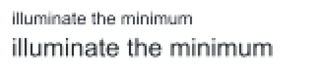
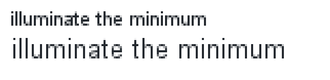
In May 2021 we received a report that text drawn with ImageSharp.Drawing came out deformed. The reporter was driving a small monochrome LCD, 128 by 64 pixels, from a rendered bitmap, and drew the same string, Tahoma at 8 points, through System.Drawing and through us. Their photographs of the physical panel made the comparison brutal: the System.Drawing text was clean, ours was misshapen, and on a screen whose pixels are simply on or off there is no antialiasing to soften anything. Strokes either land on the right pixels or the letterforms fall apart.
The diagnosis arrived within hours, and it was correct: no font hinting. It took us five years to act on it fully, though. Vertical-only TrueType hinting shipped first and improved release after release, yet the panel's text never matched System.Drawing's, and in March 2026 I closed the issue as won't-fix, convinced that closing the remaining gap meant reimplementing a proprietary rasterizer. That verdict lasted five months. Fonts 3.1 shipped HintingMode.Full, built on a rewrite of the hinter and of aliased rendering, and the reply I finally left on a five-year-old issue was that it could be done after all. Here is its scenario, reproduced from the regression test that now pins it.
HintingMode.None with antialiasing off, as the issue reported it:

HintingMode.Full with antialiasing still off:

That panel is the general case made visible. A screen is a fixed lattice of pixels, and each pixel shows a single color across its whole square face. A phone packs several hundred of them into an inch; a desktop monitor gets roughly 96. Everything a screen displays is built from those whole pixels, and antialiasing does not loosen the constraint; it only lets a pixel show the average of whatever geometry covers it. At 11 points on that desktop monitor, a line of text gets an em square about fifteen pixels tall. A lowercase letter lives in about seven of those rows, and the strokes that form it are each about one pixel wide.
Font outlines know nothing about that lattice. They are continuous curves, scaled by real-number arithmetic and placed at whatever fractional position layout produces, so a stroke that scales to 0.99 pixels wide lands with its edges at x = 1.98 and x = 2.97 as easily as on whole numbers. The best a rasterizer can do with that overlap is average it: two columns of partial coverage, two shades of gray, standing in for one solid stroke the designer drew. Multiply this across a paragraph, every stem landing on its own fraction, and small text goes soft, uneven, and tiring to read. That is the problem hinting exists to solve.
On an everyday antialiased desktop render the failure is subtler than the panel's, but identical in kind. Here are two lines of Arial, rendered at 9 and 13 pixels per em from a deliberately fractional starting position and enlarged four times, once under each of the three hinting modes the library exposes.
HintingMode.None scales the outlines and rasterizes them exactly where they land:
HintingMode.Standard fits the vertical axis and leaves horizontal placement smooth:

HintingMode.Full fits both axes, snaps the origins, and rounds the advances:
Nothing about the input changed across those renders. The letterforms, the sizes, and the starting positions are identical. What changed is how much of the font's own rendering intelligence we executed.
What a hint is #
A glyph in an outline font is a set of contours whose coordinates live on an abstract design grid called the em square, usually 1,000 units for CFF and 2,048 for TrueType. Rendering at a device size scales those coordinates. At 96 DPI, an 11-point font has an em of 11 × 96 ÷ 72 = 14.67 pixels, so a 100-unit stem in a 1,000-unit em scales to 1.47 pixels, and a stem drawn 90 units wide lands at 0.99 pixels. The proportions survive the scaling perfectly. What fails is placement: a 0.99-pixel stem whose left edge lands at x = 1.98 covers parts of three pixel columns, and an antialiased rasterizer faithfully reports that ambiguity as gray.
A hint is information the type designer ships inside the font file, next to the contours, describing how the glyph's features relate to each other: these two edges form a stem, these curves sit on the baseline, this counter matters. Hints are size-independent. A renderer applies them at a specific pixel size to move outline points onto positions the grid can represent, a process called grid fitting. The fitted outline is a small, deliberate distortion of the design, built once per size, so that rasterization produces even black stems instead of accidental gray ones.
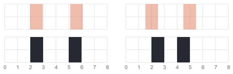
Fitting cannot be done one coordinate at a time, and a small experiment shows why. Take two stems, each 0.99 pixels wide, separated by a counter of 2.14 pixels. In each panel below, the shaded top strip shows the stems where scaling placed them, and the black bottom strip shows the same stems after every edge rounds to its nearest pixel boundary. In the left panel the rounding lands well: two one-pixel stems survive with a two-pixel counter between them. In the right panel the identical pair starts 0.46 pixels further left, and the rounded counter collapses to a single pixel while both stems stay one pixel wide. The letter becomes darker and narrower because of nothing except where on the grid it happened to start.
Useful fitting therefore works on relationships rather than points: stem widths, counter rhythm, and shared alignment heights such as the baseline and x-height. Those relationships are exactly what hints record. Where they come from, and who is trusted to apply them, is where the two font formats part ways.
Two answers from the font wars #
Adobe's PostScript Type 1 fonts, introduced in the mid 1980s, carry declarative hints: the charstring for a glyph states where its stems are and which alignment zones it participates in, and Adobe's rasterizer decides what to do with those declarations. The format was proprietary, the hint semantics were undocumented, and the quality of Adobe's interpreter was a product Adobe sold. Apple wanted out of those royalties and built TrueType, which shipped with System 7 in 1991 and took the opposite position: the font itself contains an executable program for every glyph, and the rasterizer is a small virtual machine that runs it. Microsoft adopted TrueType for Windows 3.1, Adobe published the Type 1 specification in 1990 under that competitive pressure, and when the OpenType container later unified the camps it kept both glyph formats: TrueType outlines with programs, and Type 1's compact successor CFF with declarations.
OpenType admits both formats, so a renderer that promises sharp small text inherits both philosophies at once: it must be an obedient interpreter for TrueType and a skilled reader of declarations for CFF. Much of what makes small-text rendering interesting, and most of what shipped in Fonts 3.1, follows from that split.
Hinting also has a long politics of its own. Apple patented key TrueType instruction techniques, so FreeType spent a decade shipping its bytecode interpreter disabled and inferring stems geometrically with an autohinter until the patents expired in 2010. Antialiasing and subpixel rendering then changed what "good" meant: modern rasterizers mostly fit the vertical axis and keep horizontal placement smooth, which is what Fonts 3.0's FreeType v40-compatible hinting does, and what HintingMode.Standard still does. Beat Stamm, who spent years building Microsoft's hinting tools, wrote the definitive account of these trade-offs in The Raster Tragedy at Low-Resolution, and Maxim Shemanarev's Anti-Grain Geometry essay on font rasterization surveys how each vendor chose differently. HintingMode.Full targets the oldest point in that design space on purpose: classic bi-level grid fitting on both axes, the environment the instructions in fonts like Arial were originally written for.
TrueType runs the font's own program #
A hinted TrueType glyph carries instructions that execute against its scaled outline before rasterization. The font also ships shared machinery: a font program in fpgm, a size-dependent preparation program in prep, and a control value table, cvt , holding distances the designer wants treated consistently, such as the standard weight of lowercase stems. The TrueType instruction set is a real, if small, machine language: a stack, projection and freedom vectors that define the direction of measurement and movement, a rounding state, and instructions that move points relative to other points.
A stem fit makes the model concrete. Suppose the control value table lists the standard stem of a 2,048-unit font as 166 units. At 11 pixels per em that distance scales to 166 × 11 ÷ 2048 = 0.89 pixels. The glyph program touches the stem's left edge point, then moves the right edge point to the control value's rounded distance, one pixel, from it. Both edges now sit on pixel boundaries exactly one pixel apart. A final pass with IUP interpolates every untouched point so the curves between fitted edges shift along with them. The interpreter does all of this in 26.6 fixed-point device coordinates, where 2.5 pixels is the integer 160, and Fonts performs its scaling and instruction arithmetic in the same integer domain, because a floating-point shortcut that rounds at a different moment moves a point differently than the program's author intended.
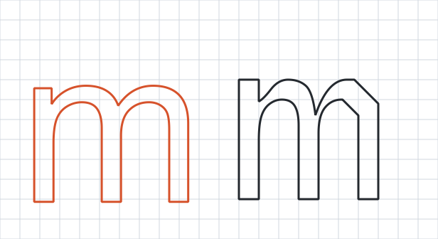
Here is that program's work on Arial's lowercase m at 11 pixels per em, the plain scaled contour on the left and the same contour after Arial's instructions have run on the right. Each orange stem is about nine tenths of a pixel wide with neither wall on a boundary. Each black stem is exactly one pixel wide with both walls on grid lines, the glyph has come out slightly narrower, and the arches have been dragged along with the stems they connect. The fitted contour is visibly cruder than the design, down to a hard diagonal where the right shoulder used to curve, and that is intentional: this outline exists only to produce pixel coverage at one size, and its rasterization, three crisp stems under an even arch row, is all the reader ever sees.
Instructions can also ask about their world. GETINFO reports the rasterizer's version and mode, and font programs branch on it: Arial takes different code paths for a classic bi-level engine than for a ClearType-era one. Under Full, Fonts presents the classic engine identity and executes the complete horizontal and vertical instruction set, so those fonts run the branch their sharpest small-size behavior lives in. Under Standard it presents the modern identity and fits the vertical axis only.
Four invisible points ride along with every glyph. The phantom points represent the glyph's side bearings and advances, the instruction stream can move them, and that mechanism is how a hinted glyph legitimately ends up with a different advance width at 11 pixels per em than linear scaling predicts. Fitting a stem is pointless if the next glyph starts at a fractional position and smears, so under Full the flow-axis advance becomes a whole-pixel value, resolved in a strict order: a device record from the font's hdmx table when one exists for the size, the hinted phantom advance otherwise, and the rounded linear advance only when the interpreter could not run.
Layout consumes the same values. Measurement under Full uses the identical whole-pixel advances that rendering uses, so a measured line and its rasterized pixels agree exactly, and two consequences follow that we accepted with open eyes. Spacing can differ from the type designer's fractional intent by up to half a pixel per glyph, and sub-pixel pair kerning is not applied on the flow axis, because the classic pipeline never applied it either, and folding a quarter-pixel kern into a whole-pixel pen position shifts a glyph a full pixel away from the reference rendering. Subscript and superscript runs keep their fractional advances, since their glyphs scale through a different ratio than the base em and whole-pixel device values would round-trip into the wrong pen movement.
CFF declares, the renderer decides #
A CFF glyph is a Type 2 charstring: a compact drawing program that emits moves, lines, and cubic curves. It contains no point-moving instructions. Instead it opens by declaring its stems: hstem pairs mark horizontal features and govern y coordinates, vstem pairs mark vertical stems and govern x, and where stems overlap, hintmask operators activate the subset that applies to each region of the outline. A cntrmask names groups of stems whose counters the designer wants controlled together. Font-wide policy lives in the Private DICT: alignment zones for the baseline, x-height, and cap height, standard stem widths, and stem-snap lists. The Type 2 charstring specification requires the declarations before the path data, so a renderer knows every load-bearing edge before it sees the first curve.
All of the fitting intelligence therefore belongs to us, and Fonts builds it around a hint map: a piecewise-linear transform per fitted axis, constructed from the declarations, that every outline coordinate passes through. Alignment zones act first: a feature that lands within a zone's tolerance is pulled to the zone's fitted position and locked to a whole pixel row. Remaining stems are placed relative to those anchors. At 11 pixels per em in a 1,000-unit font, the map takes the baseline at 0 units to row 0 and takes the x-height flat at 500 units, which plain scaling would put at 5.5, up to row 6. The cap height, ascender, and descender zones anchor their own intervals the same way.
Everything between two anchors stretches with them. A curve point at 450 units maps to 450 ÷ 500 × 6 = 5.4 pixels, where plain scaling would have put it at 4.95, because the whole span below the x-height stretched together when the x-height moved up to row 6. Curves keep their shape relative to the features around them instead of having each control point snapped to its nearest row, which is precisely the failure the two-stem experiment demonstrated.
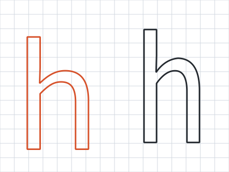
Here is the map's work on Source Sans Pro's lowercase h at 11 pixels per em, the plain scaled contour on the left and the hint-mapped contour on the right. On the left, both stems are fractional and neither the baseline nor the ascender sits on a pixel row. On the right, each stem is exactly one pixel wide on column boundaries, the baseline and the ascender top lock to rows, and the arch has stretched along with them.
The declarations earn their keep in the details. When a counter mask covers an axis's stems, Fonts chains the fitted stem centers at a common pitch, the spacing from one stem center to the next, so the accumulated rounding spreads across the chain and two counters the designer drew equal stay equal, rather than one winning a rounding decision the other loses. Declared stems whose flanks run the full height of the zone, the upright walls of an n or a bowl, regularize down to crisp one-pixel widths at small sizes, while diagonal strokes are left out of that rule because their flanks only graze the zone and narrowing them tears their coverage apart row by row. Charstrings are evaluated once into a buffered outline per pixel size and hinting mode, with their stems, masks, and Private DICT values retained, so fitting never reparses a charstring per render. Standard fits the vertical axis only, from the horizontal stems and alignment zones. Full fits both axes and rounds the em to a whole pixel size, so the map's arithmetic lands on exact rows and columns.
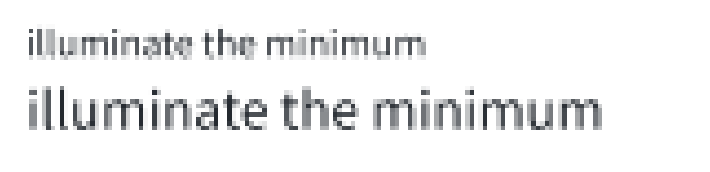
Here is Source Sans Pro, a CFF font, through the same three modes.
HintingMode.None:
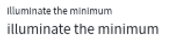
HintingMode.Standard, fitting the vertical axis from the declared horizontal stems and zones:
HintingMode.Full, fitting both axes through the hint map:
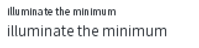
The spacing in the last render is visibly less even than in the two above it: whole-pixel advances at work, and the half-pixel variation they cost is the price of the crisp stems.
One resolved placement, everywhere #
A fitted outline is only sharp until something translates it. Text rendering composes several offsets after fitting: the pen position, positioning adjustments, side bearings, and whatever transform the caller supplies. If that composition lands the glyph at x = 10.3, the stem so carefully fitted to column 10 is fractional again and the whole exercise dissolves. So under Full, Fonts resolves the final outline placement first and snaps the composed translation of upright glyphs to whole device pixels, and every consumer reads that one resolved placement: emitted outlines, reported bounds, decoration origins for underlines and strike-throughs, and renderer cache hits alike. A renderer that short-circuits emission because it already holds cached geometry still receives bounds computed from the same snapped origin that produced the cache entry.
The same glyph at the same size owns three different geometries under None, Standard, and Full, so identity follows placement: GlyphRendererParameters includes the hinting mode in its equality and hash code, and the scaled-outline caches key on pixel size and mode together. Without the mode in the key, whichever mode renders a glyph first fills the cache, and every later render under a different mode silently receives that first geometry.
Choosing a mode #
The API surface for all of the above is one property:
TextOptions options = new(font)
{
    Dpi = 96,
    HintingMode = HintingMode.Full
};
Full is for pixels as the final medium at small sizes: UI labels, dashboards, terminal-style text, document previews, bitmap exports, and, with antialiasing off, the tiny monochrome panels that opened this story. It buys whole-pixel stems, aligned baselines, and open counters, and it pays with altered shapes, up to half a pixel of spacing variation, and no sub-pixel kerning on the flow axis. Standard keeps baselines and x-heights steady while preserving smooth fractional spacing, the right default for antialiased text at reading sizes. None preserves the scaled outline exactly, which is what large display typography wants. The hinting documentation covers the details, and the implementation, both interpreters and the hint map, is in SixLabors.Fonts #552.
The next time small text looks damaged in one application and deliberate in another, the difference is rarely the font. Both applications hold the same outlines, the same instructions, and the same declarations. They differ in how much of that machinery they chose to run.